

McCabe’s Guitar Shop Website Redesign
Introduction
McCabe’s Guitar Shop in Santa Monica, CA contains the self-proclaimed “largest selection of stringed-things to make music with in California.” In my User Experience class, I worked with a group to create a proposed website redesign for McCabe’s Guitar Shop.
Table of Contents
Creative Brief and Stakeholder Research
Highlights from our initial Creative Brief and Stakeholder research:
Primary audience: musicians and music-lovers of all ages, guitar and stringed instrument collectors, concert-goers
Intended tone: casual, homey, friendly, music nerdy, a little sarcastic/irreverent
Differentiators: local business as opposed to a national chain, affordable lessons with expert instructors, a large variety of stringed instruments (not just guitars), intimate concert venue with no liquor served
Issues with current site: online store and ticketing can be confusing, site imagery and photography can be improved, site is hard to view on a phone or tablet
Primary goal: transition to a more modern website that still reflects the comfortable, casual store environment and maintains the irreverent attitude
Heuristic Analysis
We completed a heuristic analysis of the current McCabe’s website and specifically analyzed the homepage, navigation, accessibility, content quality, visual design, and features & functionality. The highlights from this analysis were that the current McCabe’s website:
is not responsive: it was created to be viewed on a desktop and has some flaws when viewed on a tablet or desktop.
simultaneously offers instruments, lessons, repairs, and concerts. Though this wide variety of services may be beneficial, it can also be a disadvantage in that their competitions may be able to devote all of their resources to one specific field.
does not have a search bar, which forces users to click through pages painstakingly in order to find what they are searching for.
does not utilize ALT tags, which limits accessibility.
focuses primarily on concerts on their homepage. It is not immediately obvious that McCabe’s offers several other products and services.
lacks consistency. This is particularly a problem on their store page, which looks completely different from the rest of the website.
is not well organized. Specific content is not easy to find within the hierarchy, and this is exacerbated by the lack of a search button.
has some technical issues, including broken links and missing pictures.
Competitive Analyses
Each member of my team completed a competitive analysis of similar business to McCabe’s. We studied the websites of one concert venue, one music retailer chain, and two music retailer stores that each have a single location. Below, read a bit about each business as well as a few of our findings.

Chicago Music Exchange
The Chicago Music Exchange is a music equipment retailer known for its museum-like showroom. At first glance, the homepage is incredibly crowded, with six products per row when viewed on a desktop, but it is adapts well to a mobile view. Overall, this website is very easy to understand and interact with. Hierarchy is clear and visual design is consistent.

Guitar Center
Guitar Center is the largest music retailer chain in the United States. At first glance, the homepage may seem busy, but it’s all very logical and is designed linearly. The layout itself is very simple. Due to the large assortment of items, the menu is expansive, but fairly straightforward. There is a version of the website specifically designed for mobile use.

Guitar Emporium
Perhaps the most similar to McCabe’s, Guitar Emporium is a “small neighborhood guitar shop” with a single location. Some of their webpages include large amounts of text and wide text boxes, which can be difficult to read. The photographs used are often different sizes and do not appear to follow a consistent theme. The size of the navigation labels is not consistent.

Whisky a Go Go
As opposed to the other businesses we evaluated, Whisky a Go Go is primarily a concert venue. The homepage includes some redundancy and it is not immediately obvious what you can do on the site. The text size varies between pages, but the visual design is generally consistent. However, when you buy concert tickets, that page looks completely different.
User Interviews
Each member of my group completed a user interview in which the interviewer asked general questions regarding McCabe’s and its website. The feedback about the website was generally positive, and the interviewees had some insightful comments that we utilized moving forward throughout this process.
Brianna
A 27 year-old musician and music teacher at Guitar Center, Brianna has never been to McCabe’s, but she shared that she would have been interested in applying to teach there earlier in her career. She is particularly interested in how personable McCabe’s Guitar Shop seems, and she is impressed by their large assorted of brands.
Dennis
This interview took place at McCabe’s Guitar Shop. Dennis is a 46 year-old salesman who has attended a few concerts at McCabe’s. He particularly likes the personal touch that McCabe’s offers. He thought the website was straightforward and easy to use, but he was only interested in buying concert tickets.
Mitchell
Though he had not heard of McCabe’s before this interview, Mitchell (a 24 year-old student) plays guitar casually and shared that he would be interested in visiting. When browsing the website, Mitchell was discouraged that many items were out of stock. He also noted that some of the text can be hard to read.
Diego
Diego is a 51 year-old musician who has visited McCabe’s a few times. He is primarily interested in vintage guitars and enjoys visit guitar shops to buy strings and other supplies. He looked at the McCabe’s website for the first time during this interview and commented that the site lacks consistency.
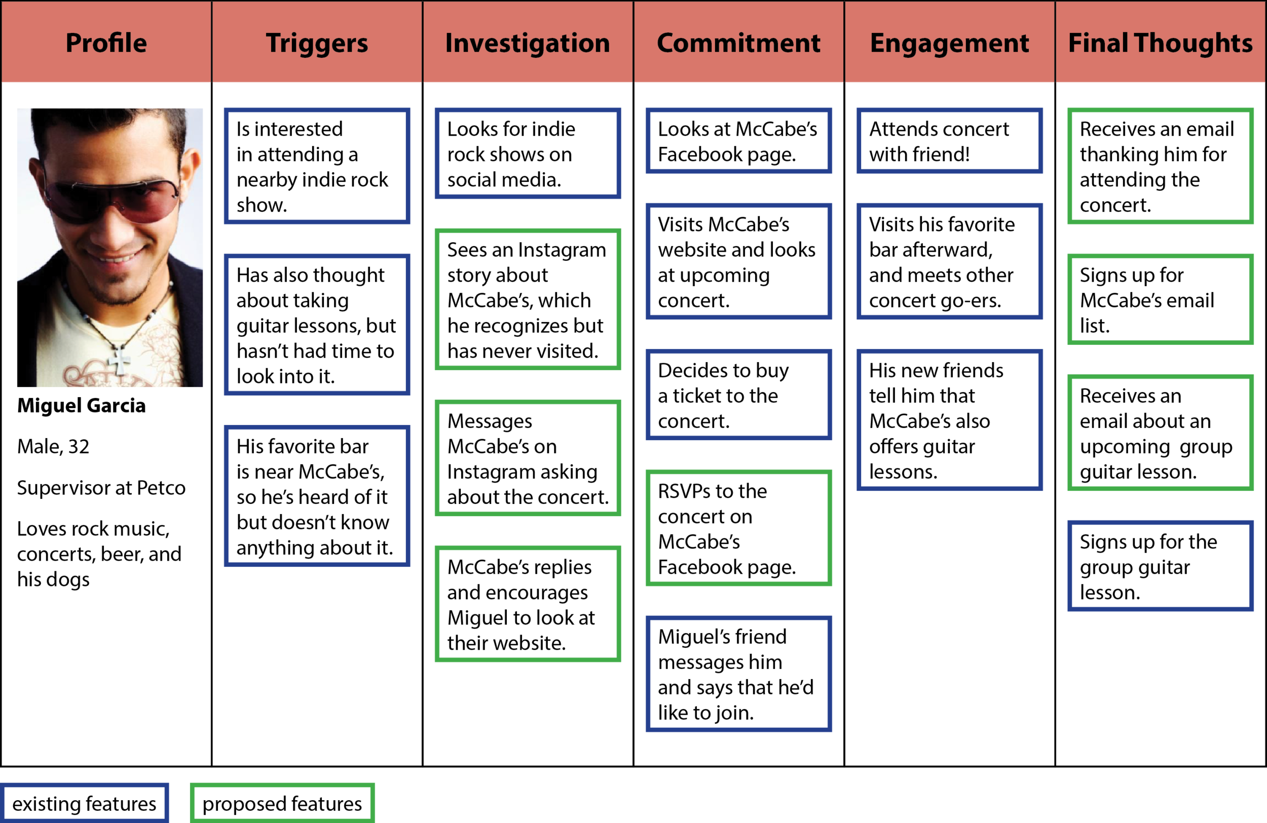
Personas
Following user interviews, each member of my team developed one persona. These personas informed our further research and helped us prioritize features for our redesign.
Get to know these potential McCabe’s customers: Sydney, Mark, Elizabeth, and Miguel.
Tools: Adobe InDesign


Journey Maps
After developing our personas, we each created a journey map that our personas would undergo when associating with McCabe’s. We considered both existing and proposed features when building these scenarios.
Tools: Adobe InDesign


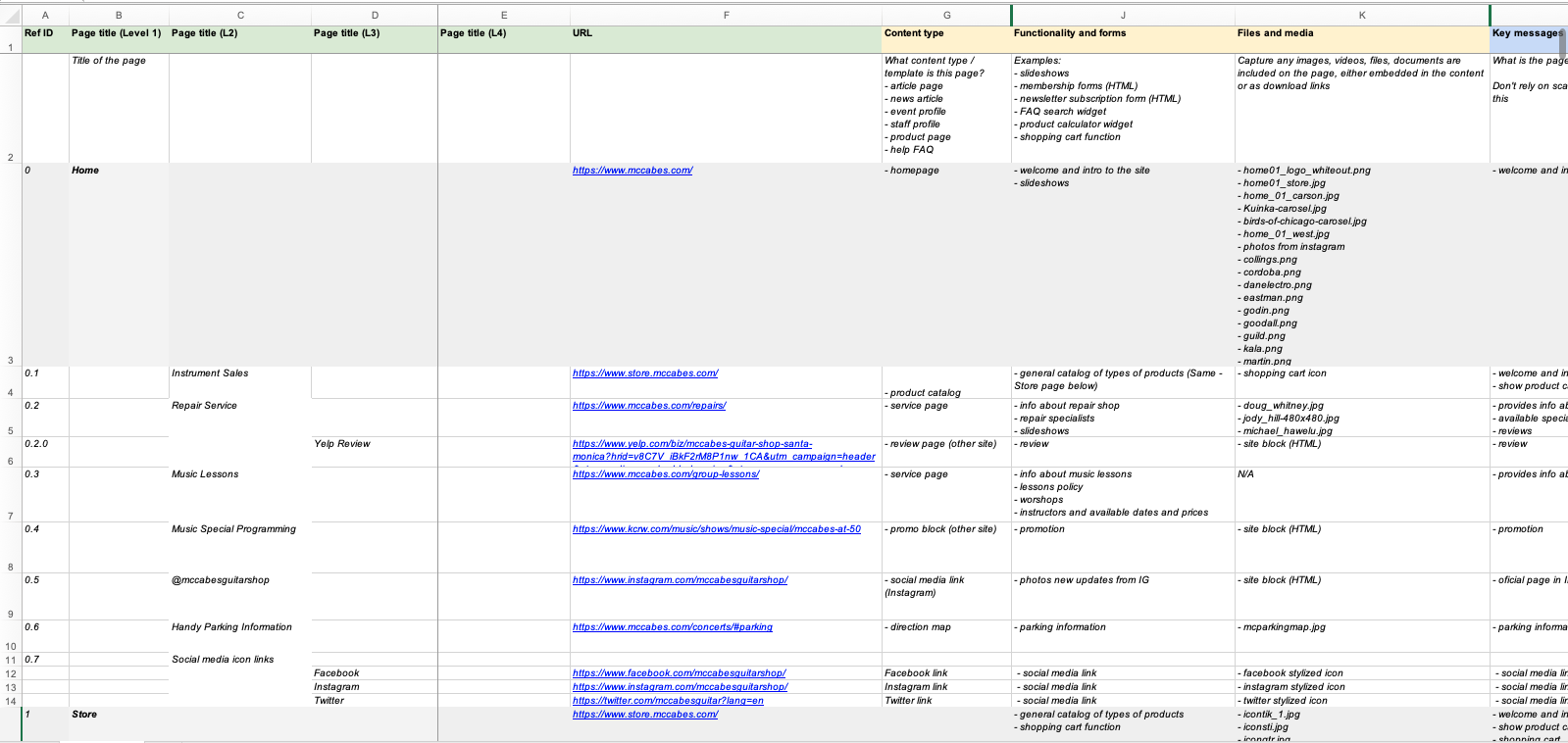
Content Inventory
At the time of our research, McCabe’s Guitar Shop included 270 individual pages within its navigation. The majority of these pages were products within the store, and many of them also came from individual pages from future and past concerts. We performed a complete content inventory of McCabe’s entire website, and we were primarily interested in any content that was redundant, outdated, or trivial.
After completing our content inventory, we established a list of features, both existing and proposed, that would benefit McCabe’s customers. For each feature, we determined a rating (0-10) for our client and for each persona. The top features with the highest averages were:
Rewards Program
A special program, offering exclusive discounts, for frequent customers.Newsletter
An email newsletter to inform customers about future events and other McCabe’s updates.Social Media Ads
Advertisements of products and services on McCabe’s social media accounts.Text/Email Alerts
Customers can sign up to receive alerts for products or services they specify, such as a notification when only a few tickets remain.Discounts
In addition to the Rewards Program, offer discounts for customers (and potential customers) on select products and services.
This exercise helped us prioritize accordingly and offered insight as we worked to determine our proposed hierarchy of features, content, and page elements. The bar graph below offers a visual representation of our feature matrix.
Feature Matrix
Card Sorting
We utilized card sorting to determine the most effective sitemap for McCabe’s. Each member of our group completed a card sort interview with a potential McCabe’s customer, in addition to us each completing a card sort of our own.
Tools: Trello

Site Map
We discussed our findings from each card sort and developed one site map that most intuitively organizes each webpage.
Tools: GlooMaps

Usability Testing
After creating an initial round of wireframes, each member of my team completed usability testing with a potential McCabe’s Guitar Shop customer. We used the key findings from these tests to inform our final version of the wireframes.
Chris
Chris was the only interviewee who had previously attended a concert at McCabe’s. A 33 year-old Engineer, he appreciated the simplicity of the wireframes overall and enjoyed the large images. In particular, he liked the ability to sort products by price range, but wanted to be able to click on each picture to get a better view.
Valery
An online shopping lover, Valery (a 43 year-old Marketing Associate) was most interested in the product page, but wasn’t sure how to modify the quantity of items within the shopping cart. Additionally, she appreciated the option to login via a social media account so she wouldn’t have to fill out a lot of forms while signing up.
Jenny
Jenny is a 35 year-old Accountant who found the wireframes to be very straightforward overall. She was most confused about how the shopping cart would look when buying a ticket (as opposed to buying an instrument). She also suggested adding a link to each artist’s website on the McCabe’s concert schedule.
Zack
Multiple users, including Zack (a 24 year-old student), appreciated the inclusion of the map in the footer. Zack was confused about why the concerts were prioritized so much on the homepage. “It’s a shop,” he remarked, “the main purpose should be to sell things.” He added that the website should include product reviews from users.
Wireframes
As the culmination of our user research, my group perfected desktop and mobile wireframes for all of the page types we determined were important to McCabe’s Guitar Shop. A selection of these wireframes are included below.
Tools: Balsamiq Wireframes


Reflection
Working on this project provided me with a comprehensive understanding of the user experience process. From our initial creative brief to the final draft of our wireframes, my group worked together to build an intuitive, responsive website for McCabe’s Guitar Shop. This experience helped me recognize that I am passionate about user experience design, and I am grateful to have had the opportunity to complete this project.
Team Members: Manuel Chavez Godoy, Marianne Nino, Xenia Ruchka
